Nelson festival gets jazzed-up.
When Frances McElhinney from Nelson School of Music approached us about doing the Nelson Jazz and Blues Festival artwork last year, we jumped on it like a boy on a bouncy castle. We have been designing artwork for local festivals for more than twenty years, and our experience coupled with our enthusiasm was well received by Frances.
Due to budget constraints, we only had enough time to have one decent crack at it — limiting how much we could do creatively. The artwork needed to be bold, bright and connect with people in a tangible way.
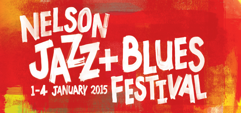
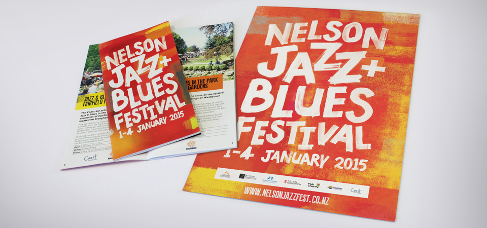
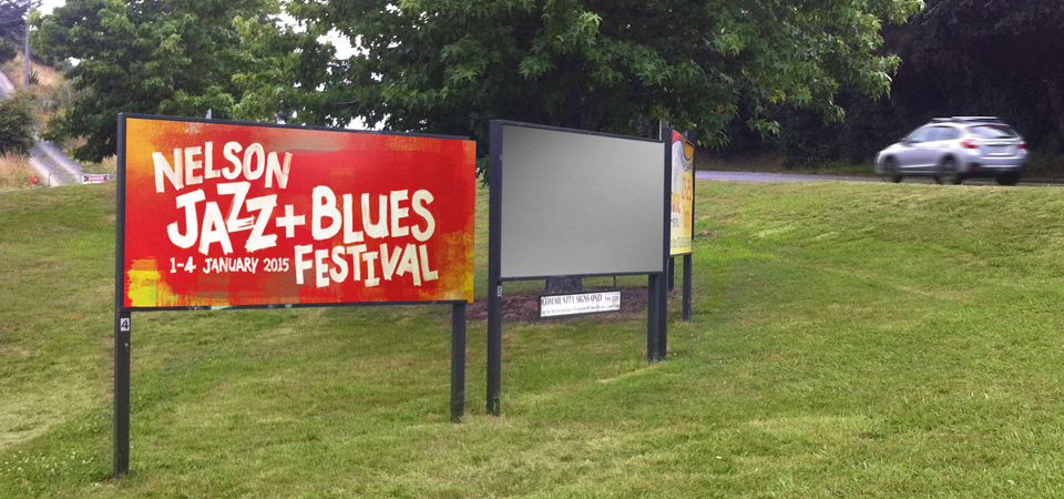
We began by creating the typography — made by hand, using sponge brushes and paint. This technique gave us big bold lettering with a humanistic feel. We then created the background artwork with a combination of sponges, paint and ink rollers. Hot reds and bright yellows with the Jazz and Blues Festival typography over top created a finish that was exactly what we had been looking for.

It was a bright, fun, and in-your-face design that met the brief and got people excited about the festival. We produced a 24-page booklet, posters, web artwork, and billboards that painted Nelson red for the months leading up to the festival.
“It’s looking fresh, funky, and very summertime and that’s what it’s all about,” said Frances at Jazz and Blues in the Park.
It kicked off with Jazz and Blues in the Park at Nelson’s Fairfield Park. The warm sun was joined by a cool breeze on the park’s slopes making conditions perfect. By 5pm the crowd was estimated at 3000, and each following event was a full house.
The festival, overall, was a success.