There seems to be a lot of confusion about brand, logo, and identity design. We talk to Tony Downing of Downing Creative Marketing to unpack what brand identity is.
We’ve found that a lot of businesses and organisations have identity issues,” says Tony. “Bell-bottoms were great in the 70’s and mullets were wild in the 80’s, but can you imagine trying to display all your past fashion choices today?” Tony has found that many businesses do this with their brand identities. They get a logo designed, then as the years go by, they change and the world changes and before you know it your business image is out of touch.
So what is brand identity? Your brand identity is the system you use to present your organisation to the world in the most appealing way possible. Your brand is the perceptions of values, personality and experiences a customer has in their mind about you. “Your brand identity is not just your logo,” says Tony. “Your logo is part of your brand identity, and your brand identity is an expression of your brand.” If your organisation were a person, your brand would be your mind and soul and your brand identity would be the clothes you wear. Good identity design is born out of research and strategy that articulates your brand. This sets the platform to build an appealing and creative image. Done properly, it can be one of the most valuable assets your business owns.
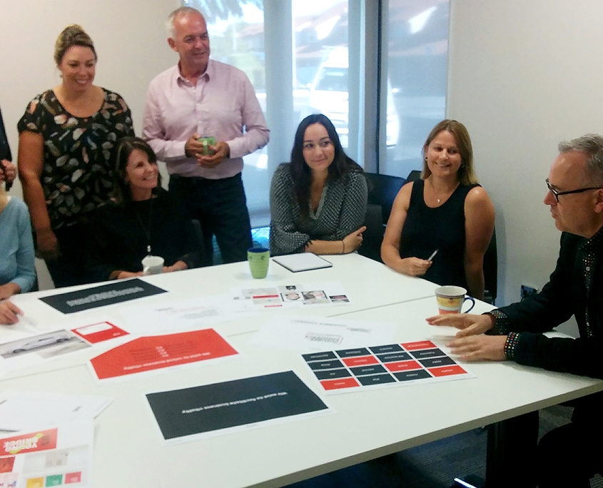
A recent identity project Downing has worked on is with the Nelson Tasman Camber of Commerce. Downing worked with the Nelson Tasman Chamber of Commerce to produce a refreshed visual identity. The first step involved Downing facilitating a brand workshop with the Chamber team. “We worked with the team at the Chamber to develop a strategy that captured the essence of who the organisation is (the brand). This laid the groundwork of their identity system, and out of that came a refreshed logo and brand assets.” The workshop helped to articulate core tasks, values, personality, value proposition and essence.

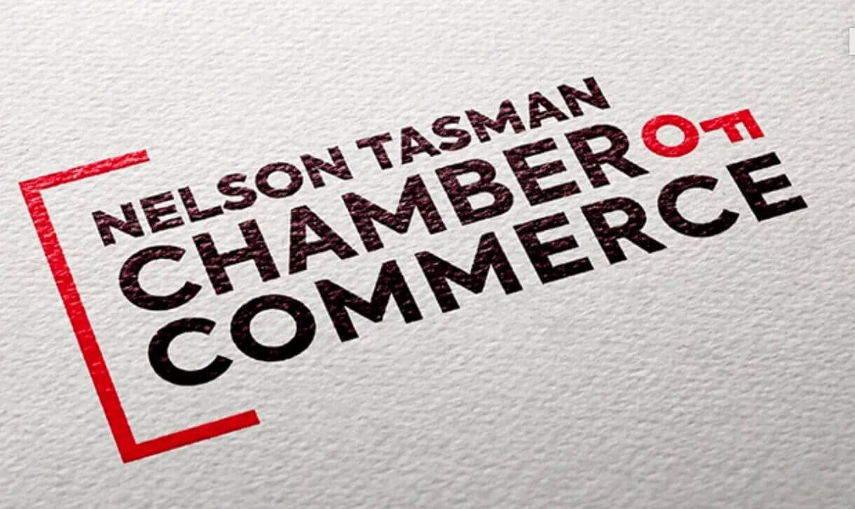
Sometimes the simplest ideas are the best. “One of the first ideas we developed related directly to the strategy we had done in the workshop,” says Tony. “It was simply turning the ‘F’ on its side, which created the image of a key.” It was this simple and clever change that instantly connected the logo to the Chamber’s purpose of unlocking business vitality.
The other visual part of the logo is the red half-square on the left of the typography. “The bracket symbolises the ‘C’ for Chamber,” says Tony. “A chamber is a large room where important discussions take place; the bracket captures this concept. This bracket portrays the values of inclusiveness, relationships and whanaungatanga.”
The refreshed logo, vibrant Braeburn Red and fresh design style align with the new strategy and signal a new era for the Nelson Tasman Chamber of Commerce.


