Tattoo art captures physical theatre dynamism.
In March this year, our creative team set to work with a brief to create a visual identity for the Nelson Arts Festival 2013, a brief that reflected the overwhelming number of physical theatre performances the programme would eventually contain. Every year, creating original, engaging artwork for the Nelson Arts Festival is a challenge our designers look forward to: an opportunity to capture the essence of the festival ahead and turn it into imagery with the power to generate excitement long before the festival begins, with sufficient depth and storytelling magic to remain fresh and vibrant throughout the three weeks of festival events, and an inherent delight that ensures that rarely a poster remains (non- souvenired) following the finale event.
Step One —————
Inspiration
Before jumping into the creation of artwork, we began by collating imagery we felt could serve as inspiration. We then compiled the images into mood boards: each representing a particular style or theme. This helps to clarify our artistic direction. This year we came up with a number of highly distinctive styles, each with genuine potential that could be further explored. A decision had to be made.
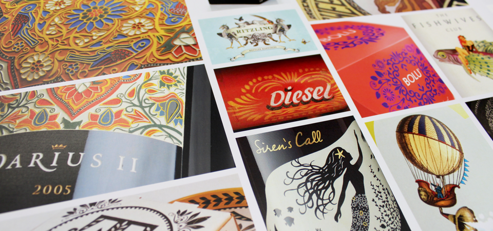
Eastern artwork exploration.
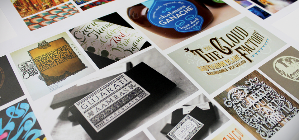
Typography exploration, an extension of the Eastern theme.
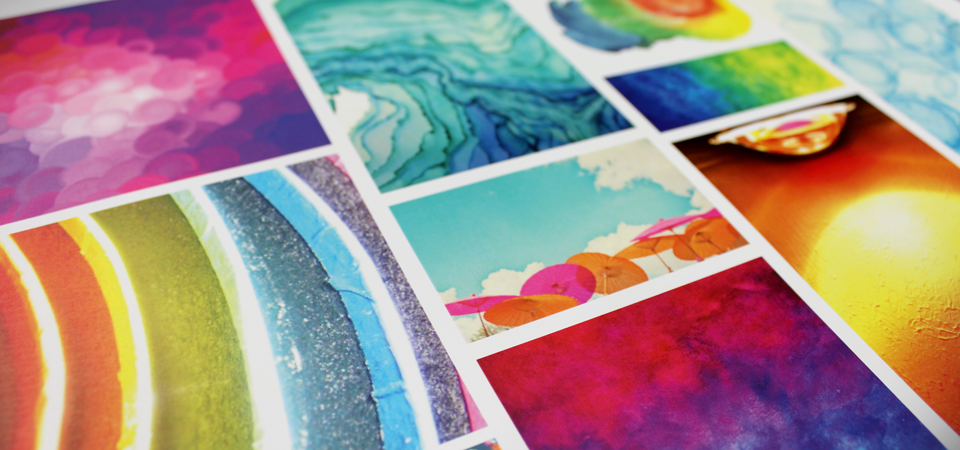
Explosions of bright colours – a theme that emphasized the vibrancy and diversity of the festival.
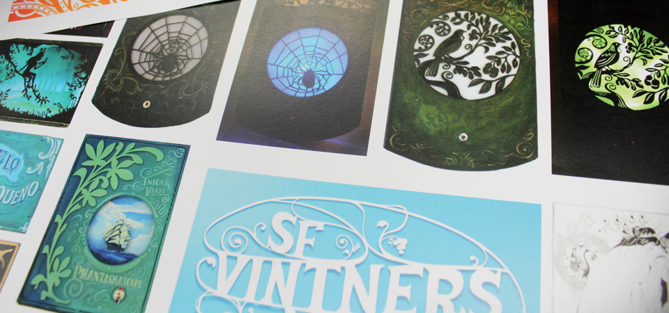
Paper cut outs with light shining through – a theme that captures the theatricality of the festival.
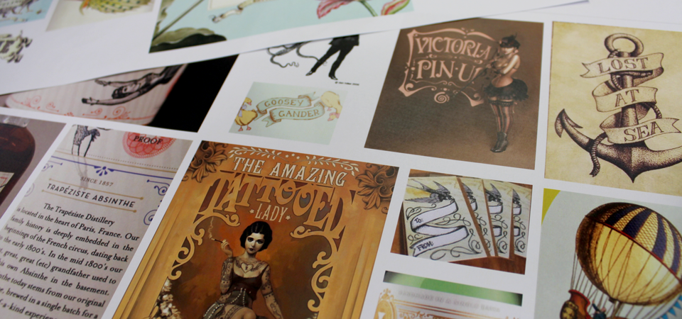
Tattoo art and carnivale artwork.

Further exploration of the carnivale art theme.
Step Two —————
Sketching ideas
Meeting with the Nelson Arts Festival team we discussed the mood boards and explored which style would most capture the spirit of the festival in 2013 . Carnivale Tattoo Art was selected as the most connected theme, it mirrored the atmosphere that the festival team were intending to create at Founders Park (the home of the festival), and succinctly reflected the diversity of performance styles the 2013 festival would contain.
Our creative team went to the drawing board.
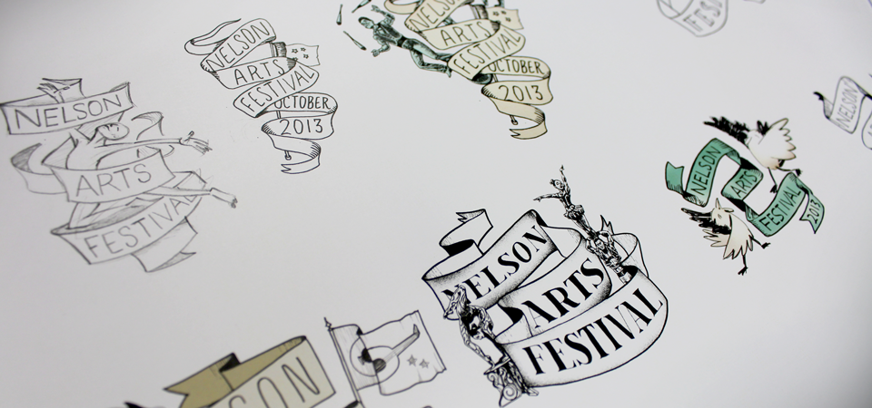
Sketched ideas for cover art.
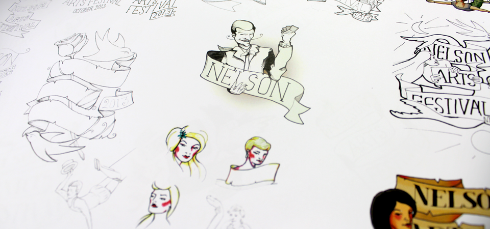
Refining illustration elements: the character’s faces, the carnival theme, and variations on ribbon art.
After much exploration, tweaking and refining – the final illustration emerged.

Final illustration for the programme cover, created in pencil and ink.
Step Three —————
Programme design
With our illustration ready to roll, we added colour and applied it to the programme cover design. The predominant colours are in shades of deep green; colours quite different from those used in previous years (pinks, yellows, purples), but equally vibrant.
The programme is the central promotional tool for the festival and many hours are spent working alongside the Arts Festival Team to produce something that truly showcases the event, is easy to follow, is correct in terms of the event details, and looks good enough to grace the many cafe tables, coffee tables and desks on which it will eventually land.

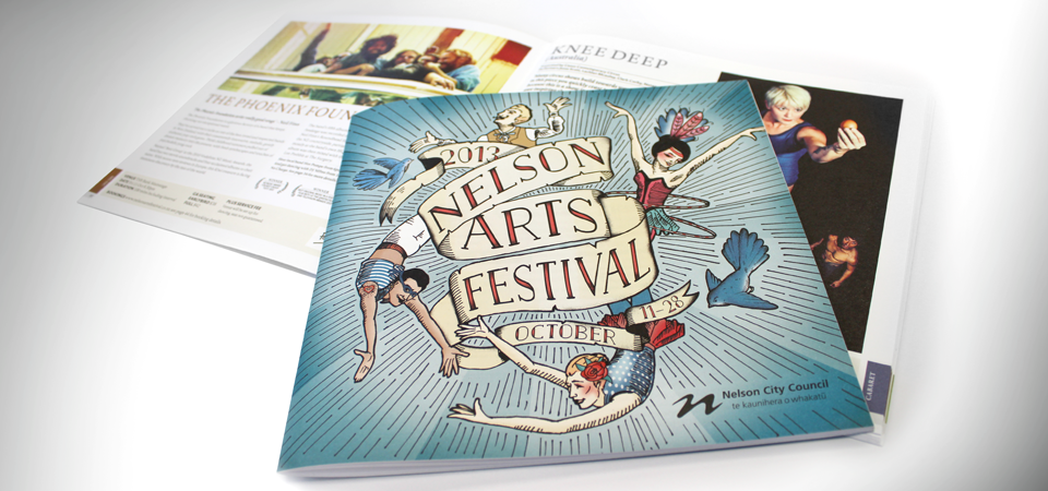
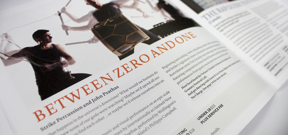
The final programme for the Nelson Arts Festival 2013.
Step Four —————
Signage, posters, banners, vehicle artwork, flags, and more!
The completion of the design process is when the final artwork is applied to a raft of promotional items – each working in different ways to take the Arts Festival message out to the world. Each promotional tool needs to contribute to showcasing the great shows that will be on offer – so each employs consistent imagery, a clear message, and just a little splash of magic. Here’s a selection of some of the promotional items created for the Nelson Arts Festival 2013:
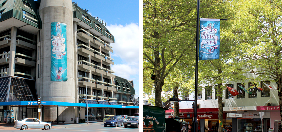
Clock tower banner; street banner on Trafalgar Street, Nelson.
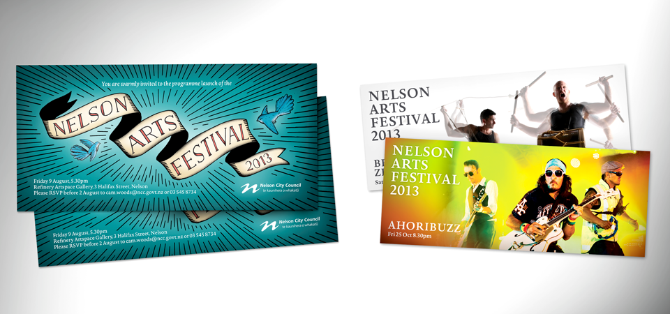
Launch invitations and web banners for two of the shows.

Stage One backdrop banner; festival van artwork.
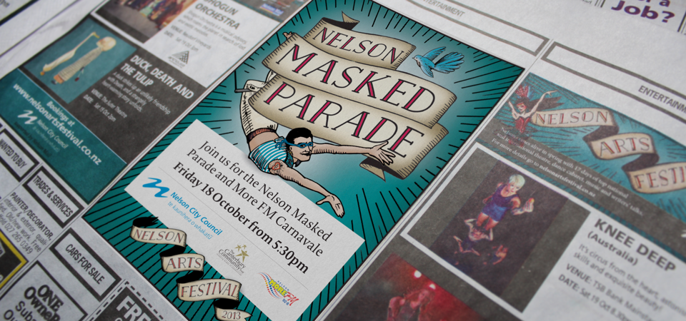
Press ads.
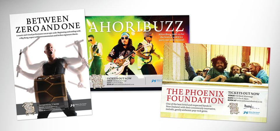
Individual show posters for three of the shows.
And there you have it – another successful year with the Nelson Arts Festival!

