It is said, that in the old days the ocean felt empty. So she filled herself with life, and named the salmon her kings.
She hid a portion of these salmon. In dark places she grew them — where other fish fear to wander. She named these few Tyee, and set them apart to be kings among kings.
No two Tyee are alike. They have wrestled their way to the top. Their fins may bear the scars of a life truly lived, the remnants of frays won, and lost.
Tyee are rare among salmon. No less than 30 pounds in imperial weight, this salmon is a giant. A leviathan that will sear itself in your mind for years to come.
The Brief
New Zealand King Salmon approached us to work on a new product that was going to be bigger than anything we’d done before. We partnered with them to launch a new brand of Ōra King salmon called ‘Tyee’. The life-cycle of a salmon usually ends after spawning, but some rebellious few continue to grow beyond what is normal for salmon. This phenomenon occurs naturally in the wild and in their environment in New Zealand.
The name Tyee means ‘Chief’ in the local language of British Columbia where they were originally found. Tyee weigh over 30 pounds, and have been caught in Campbell River since 1924. Tyee were originally caught from a boat with no motor, with a hook with no barb.

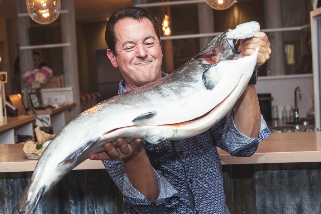
Grant Rosewarne from New Zealand King Salmon wrestles with a Tyee

The Challenge
We were challenged to create a brand narrative for these leviathans, and to roll that out over logo, packaging, digital, and motion.
With only a few of these salmon available each month, the positioning of this Tyee was ultra-premium. It needed to hold-it’s-own against the likes of Blue-fin Tuna which can fetch high prices in the seafood market. We worked closely with the team at Ōra King to craft an authentic story and build hype about this new product.
The Process
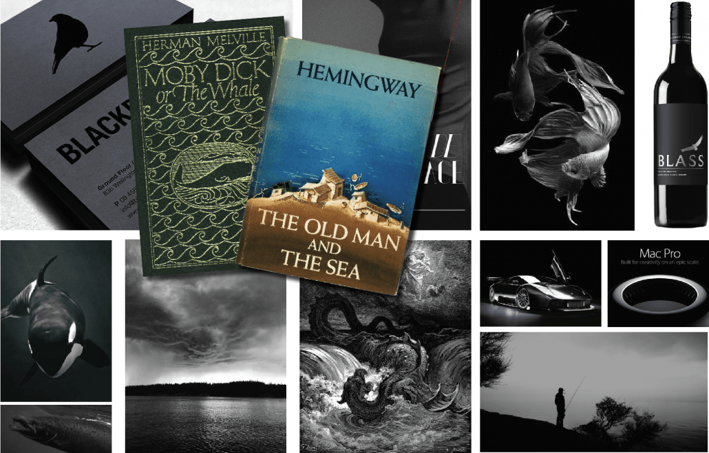
The Tyee story brand process began with a solid amount of thinking. We drew inspiration from books like The Old Man and the Sea by Ernest Hemmingway and Moby Dick by Herman Melville. We crafted a story inspired by epic folklore legends, and built a narrative that conveyed a sense of myth and mystery.

Discovery into creating the Tyee brand identity. Dark, mysterious and alluring were some of the words that were to define the story.
The Logo
We constructed a custom typographic logo for Tyee. The letters were inspired by the fins and shapes of a King salmon. The logo is tall and bold, designed to convey a sense of presence and size. Along with the logo we crafted an emblem, a portion of a Tyee tail flicking out of the water. It has been done in the style of an old nordic symbol to add to the mythology of the creature.

We used shapes from a King salmon to create the Tyee letterforms.

The Tyee letters are set to a grid to add to the overall uniformity of the word-mark.

The Tyee emblem.
Black Water Illustration
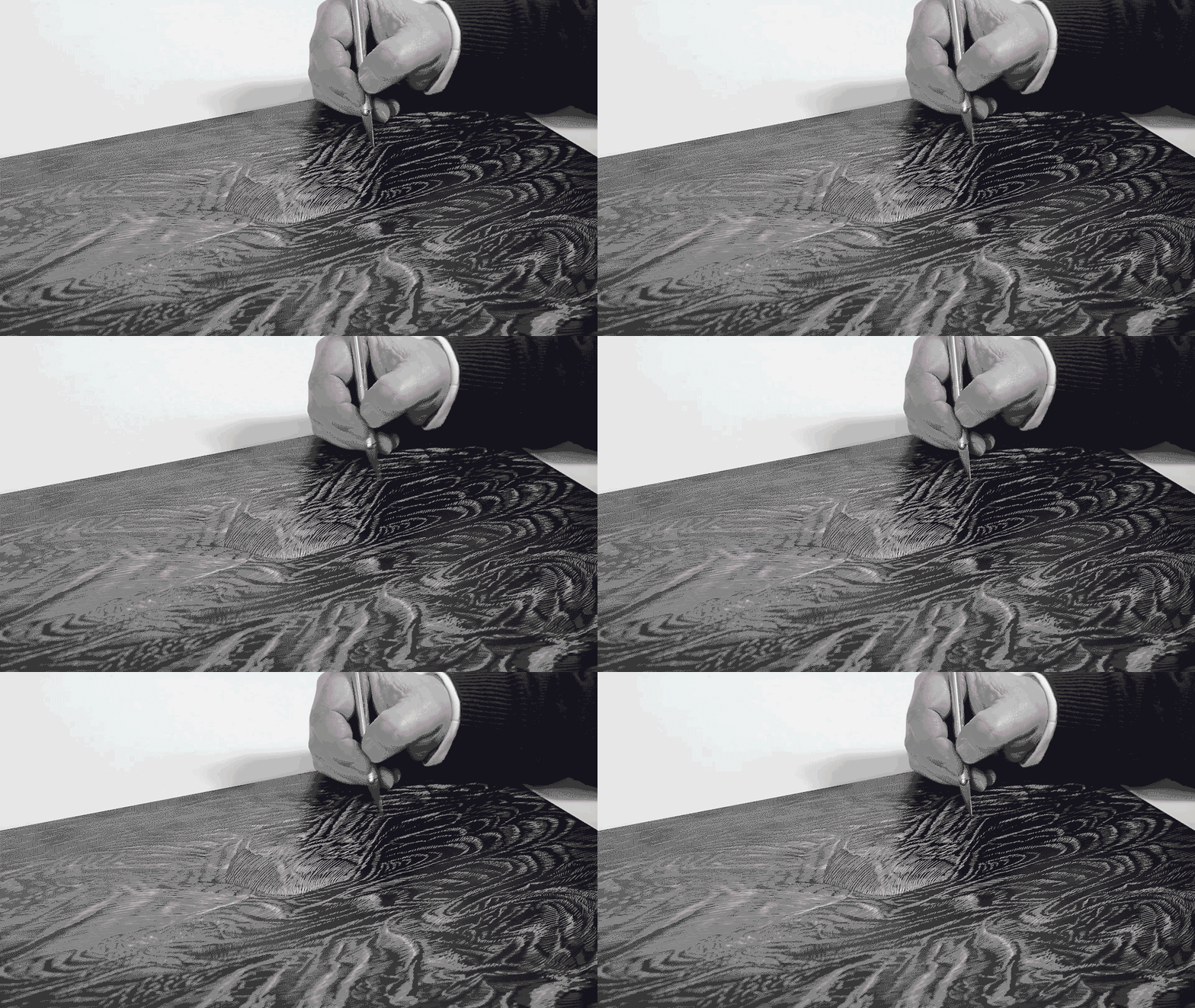
Tony Downing created a custom, hand illustrated ocean-scape to use as an asset on all branded collateral. He did this with black ink and scraper-board. It is a moody, emotive scene that is full of currents and churning waves. Having an image like this reinforces the mythology of Tyee.

Tony created the black water illustration on scraper-board.

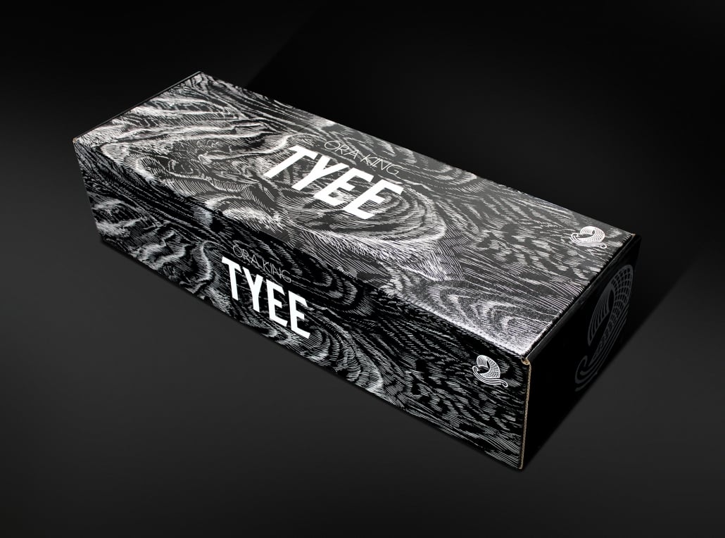
The Tyee box is clothed in the black water illustration we created for the brand.
The Box
The box is a marvel of cardboard engineering. It uses double layered thermal cartons which creates a resilient temperature barrier to protect the fish during its journey to the end customer. The box is clothed in the Black Water illustration to reinforce the complete brand story.
Teaser Videos
We produced a series of short videos to create anticipation for the launch of Tyee.
The idea behind the videos was ‘Something bigger is coming’. We knew these salmon were enormous and we wanted to showcase that. We illustrated scale with different sized plates and movement of cutlery. And for the final shot we used a full-size Tyee steak to show chefs how big these fish actually were.
Launch Video
For the launch of Tyee we wanted to create something special. Our idea was to create a video of the Tyee logo emerging from the dark depths of the ocean. There are two ways we could have achieved this: 1. With special effects; or 2. To physically create the logo and push it up through water. And because we love authenticity and crazy ideas, we went with option two.
You may not know this, but in Nelson we are lucky enough to have an international-standard underwater photography studio. Kashiwa Studio in Atawhai, run by photographer/activist José Cano, was the perfect place to create our vision of the ultimate Ōra King Tyee introduction.
We created a prop of the Tyee logo fixed from behind with a long metal handle. It looked like a giant black fork holding four flat marshmallows. After numerous tests, José donned a completely black wetsuit and scuba gear, and submerged himself in the black water of his studio. One of our favourite film-makers, Daniel Allen, suspended his camera above the water and proceeded to create a beautiful piece of film.
The result was a simple clip of the Tyee logo emerging from the darkness. Eerie and cinematic, this was the perfect video to launch Tyee.
Teaser videos before the launch of Tyee. Used in social media.

José and Emma of Kashiwa studios have developed a unique underwater language with a mixture of hand-signals and tapping.
Tyee launch video of the logo emerging from black water.
The Response
Ōra King Tyee has been wildly successful. When Tyee launched it fetched the highest price ever paid for a King Salmon, with an American foodie paying $1700 NZD for one Tyee.
There are no other salmon producers worldwide that are offering salmon within the ultra-premium category. It is already highly sought after by discerning chefs worldwide, and is being praised for its delicate flavour, herbaceous palate, beautiful layered flesh, and firm texture. Tyee are so popular that they are sold out months in advance.

