Rebrand Case Study: Refreshing the brand identity and website of Nimbus Software

Nimbus create accounting software that is a little different. They help people across New Zealand manage their businesses with clarity. This means businesses leaders aren’t buried under mountains of data, instead they have it all at fingertips, giving them the freedom to focus on what matters.
Nimbus team felt their current brand was outdated and didn’t accurately reflect the culture of the business or the wide breadth of services available under their software umbrella. So they came to us for a brand refresh.


We embarked on a collaborative journey with the Nimbus team, diving deep into what made them tick. We came to the understanding that Nimbus weren’t just offering simple software solutions — they were giving business leaders the freedom to focus on what matters. It’s the satisfying feeling you get when all your ducks are in a row, and your business is running like a well-oiled machine. The creative process began with a challenge – how do we visually communicate the feeling of freedom?


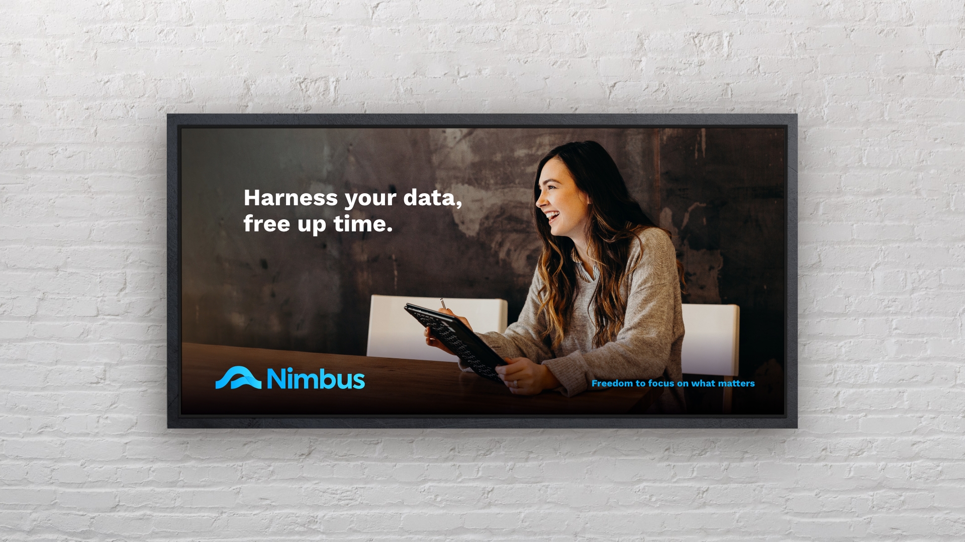
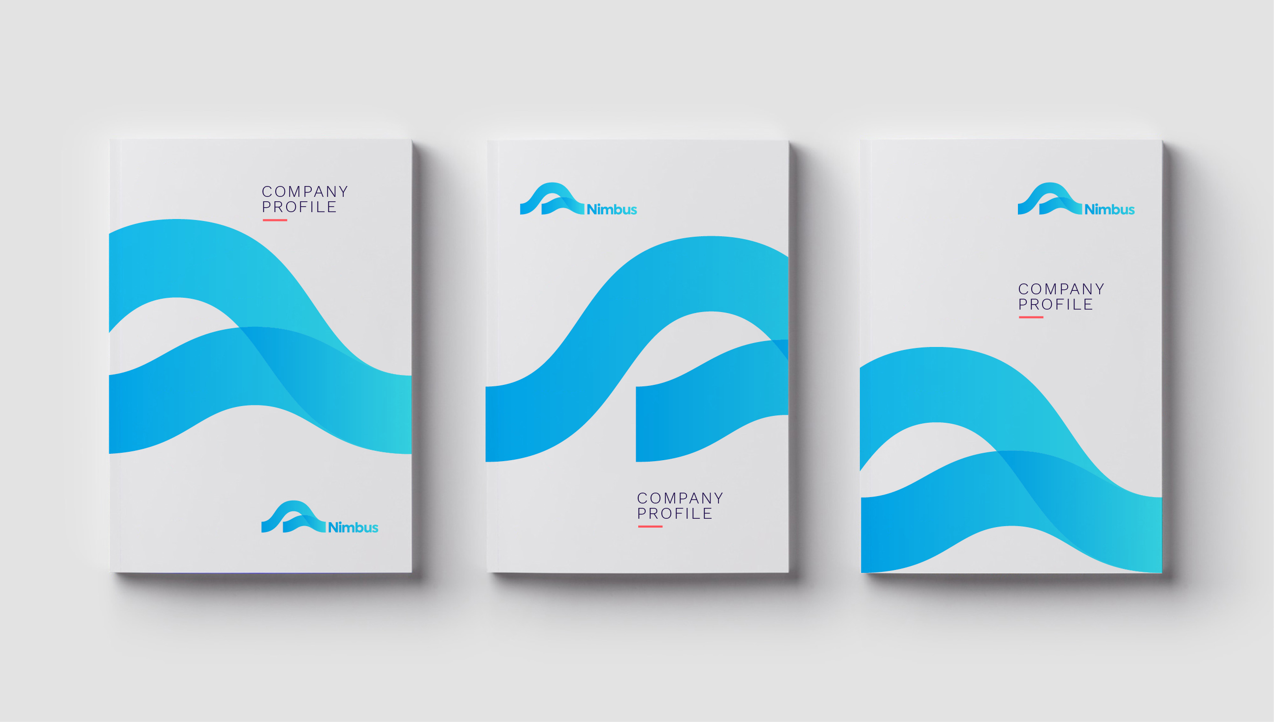
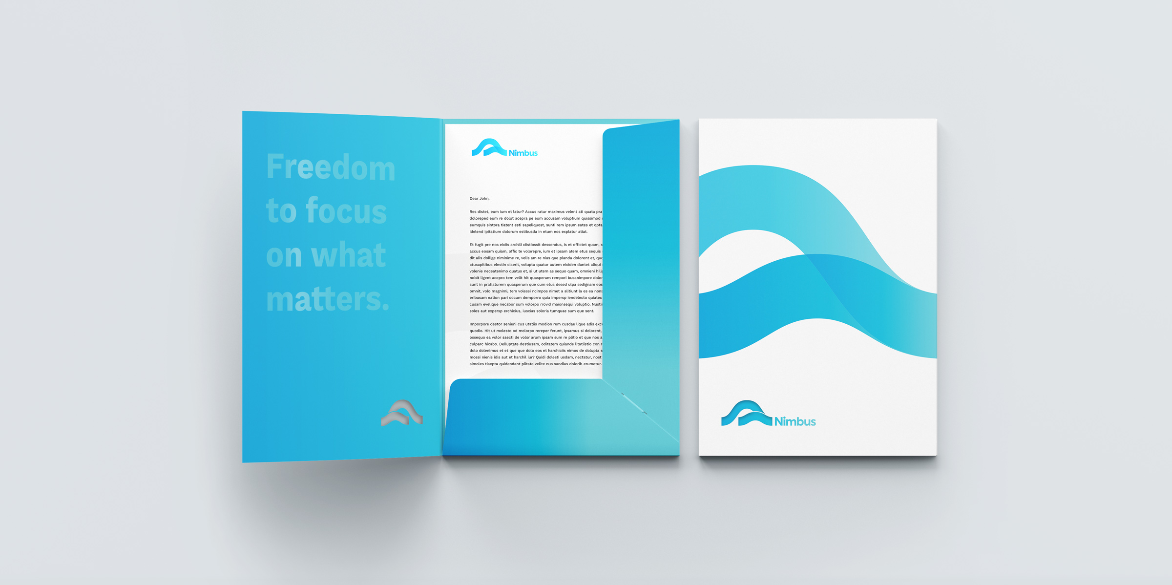
Downing then helped Nimbus roll out their new brand across their external and internal touch points. From simple stationery items such as notebooks and presentation folders, to essential business documents such as email footers, business cards and invoicing templates. We developed a series of digital assets for email campaigns, social media and even Zoom background images.


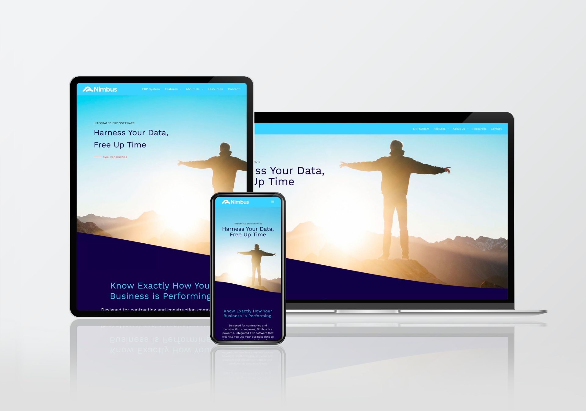
“We have seen an immediate increase in lead generation from the right type of prospective client. And our existing clients use the website as a resource, and it helps them to understand the breadth of the offering and the opportunities that our product offers them.”
Gail Murdoch — General Manager

